The Anatomy of a Tableau 8 Dashboard (or a “floating tile grid autopsy”)
With the release of Tableau 8 just around the corner, and the Tableau 8 Public servers in a (very) limited release beta - I figured that it was good a time as any to see what I could come up with using (a couple) of the new features. Specifically the "floating tile" option for dashboard creation (one that I'm particularly jazzed about, as you'll see)...
"Floating Tiles" = A Game Changer
Previously in 7 (and earlier) you were restricted to putting dashboard "parts" (for lack of a better term - think worksheets, text, and images) into a editable "grid" pattern. While this allowed some cool designs if you wanted to get creative - you could really only go so far. Now since that has been lifted (with the added inclusion of allowing overlapping dashboard parts) we are going to see some really cool designs.

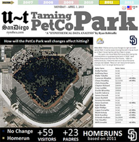
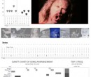
I wanted to visually illustrate how the new dashboard layout rules radically change the dash construction and design in Tableau 8 - so I started up Photoshop to give this particular viz a "grid autopsy". Anyone who is familiar with Tableau in any way should be able to see quickly what we've got going on here.
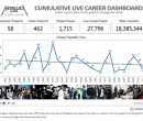
This dashboard viz is literally made up of 21 separate Tableau worksheets, plus several static images and static text boxes.
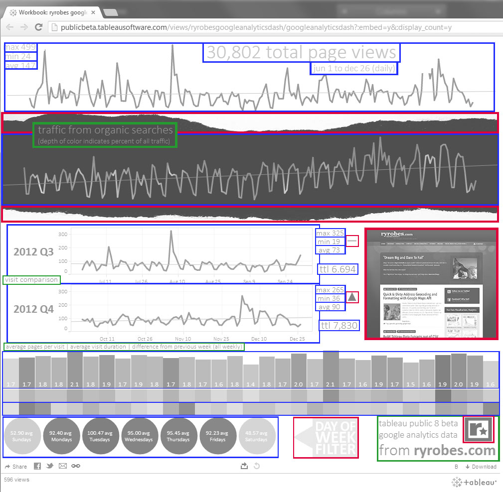
- Blue - Tableau Worksheet
- Red - Static Image
- Green - Static Text
Also, the ability to move tiles pixel by pixel and size them pixel makes it possible without contemplating murder.
For the record, SOME of this would have been somewhat possible with 7, but it would have been a total trauma to keep things aligned properly - and generally not recommended for anyone who wants continued grip on their sanity.
Ex.
To be continued... :) Really looking forward to what everyone else comes up with too!